

This Cleaning Memo is a continuation of the discussions in the July 2022 and August 2022 Cleaning Memos dealing with data evaluation to determine the “health” of a cleaning validation program. Please review those before you continue with this month’s Cleaning Memo. The focus here will be on trending data over time to provide a “picture” of the “health” of your cleaning validation program. Last month we covered the use of histograms to provide a one-time snapshot of data. This month we will consider trending, which you can think of as a “moving picture” (as opposed to a snapshot). For this we will cover the use of bar charts (another name for histograms) and line graphs, along with the possible rationales for each.
In trending evaluations, we are specifically interested in changes of sampling data results over time, which may include lack of changes. Actual changes for data might be desirable (lower values) or might be undesirable (higher values). In giving examples, I will continue with the baseline data from examples from prior months, and illustrate what the outcome might be with additional data at one or more times in the future. Also, as mentioned in the last example in last month’s Cleaning Memo, the data may be evaluated as specific reported values or as “banded” values.
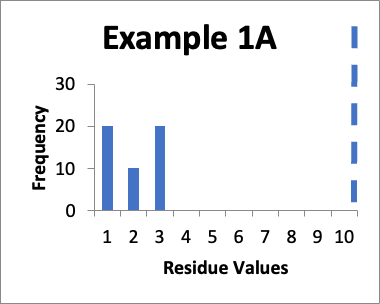
In this example, my original validation involves fifty swab results. Of those, twenty are 1.0 mcg/swab, ten are 2.0 mcg/swab, and twenty are 3.0 mcg/swab (same as in Example 1 last month). My cleaning validation limit is 10 mcg/swab (this is the USL). The calculated mean is 2.0 mcg/swab, the calculated SD is 0.90 mcg/swab and the Cpu is 3.0. Below is that data presented in a simple histogram as Example #1A.
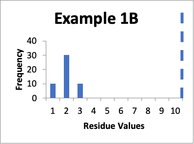
Let’s say that at a later date I repeat the protocols and collect new data from the same 50 locations. Of those data values, ten are 1.0 mcg/swab, thirty are 2.0 mcg/swab, and ten are 3.0 mcg/swab. My cleaning validation limit is 10 mcg/swab. The calculated mean is 2.0 mcg/swab, the calculated SD is 0.60 mcg/swab and the Cpu is 4.2. Below is that data presented in a simple histogram as Example #1B.
Please note as you view these two histograms (as well as the two histograms for Example #2), the scale on the Y-axis differs.
If I just look at the Cpu, it appears that the second set of data is better, in that the Cpu is higher (4.2 versus 3.0). This should also be apparent from the “shape” of the histogram in Example 1B, where it appears closer to a “normal” distribution. An alternative evaluation might just conclude that, without looking “into the weeds”, the two sets of data are practically the same and are both significantly below the calculated limit. In other words, I would not get terribly excited about any perceived improvements in the later data because clearly some specific sample locations might have increased in value while others might have decreased in value.
In this example, my original validation involves fifty swab results. Of those, forty seven are 1.0 mcg/swab and three are 5.0 mcg/swab (same as in Example 2 last month). My cleaning validation limit is 10 mcg/swab. The mean is 1.2 mcg/swab, the SD is 0.9 mcg/swab and the Cpu is 3.0. Below is that data presented in a simple histogram as Example #2A.
Let’s say that at a later date I repeat the protocols and collect new data from the same 50 locations. Of those data values, thirty eight are 1.0 mcg/swab and twelve are 3.0 mcg/swab. My cleaning validation limit is 10 mcg/swab. The mean is 1.5 mcg/swab, the SD is 0.9 mcg/swab and the Cpu is 3.3. Below is that data presented in a simple histogram as Example #2B.
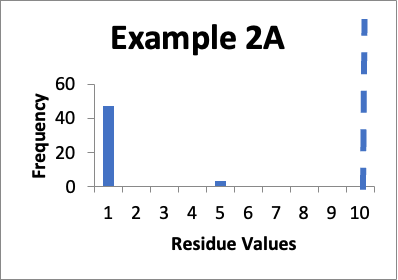
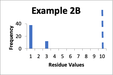
If I just consider the Cpu, it appears that the second set of data is slightly better, in that the Cpu is higher (3.3 versus 3.0). In these two cases, nether is a “normal” distribution. And, while there are no results of 5.0 mcg/swab in the second example, there are a large number of locations where the values have significantly increased. However, those increases (to 3.0 mcg/swab) are still well below my limit. Particularly if those locations that increased from 1.0 mcg/swab to 3.0 mcg/swab were “hard to clean” locations (as opposed to just “representative” locations), I would be less concerned that any changes in the data might be practically significant.
In this example, my original validation involves fifty swab results. Of those, four are 7.0 mcg/swab, forty two are 8.0 mcg/swab, and four are 9.0 mcg/swab (same as in Example 5 last month). My limit is 10 mcg/swab. The mean is 8.0 mcg/swab, the SD is 0.4 mcg/swab and the Cpu is 1.6. Below is that data presented in a simple histogram as Example #3A.
Let’s say that at a later date I repeat the protocols and collect new data from the same 50 locations. Of those data values, four are 3.0 mcg/swab, forty two are 4.0 mcg/swab, and four are 5.0 mcg/swab. My limit is 10 mcg/swab. The mean is 4.0 mcg/swab, the SD is 0.4 mcg/swab and the Cpu is 4.9. Below is that data presented in a simple histogram as Example #3B.
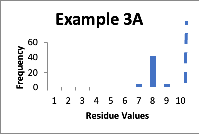
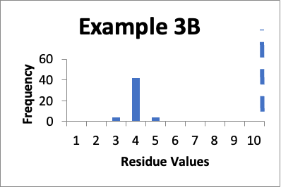
If I just look at the Cpu, the second set of data is better, in that the Cpu is higher (4.9 versus 1.6). In both these cases, however, the data appears closer to a normal distribution. But, the data has shifted and in Example 3B is in general lower by 4.0 mcg/swab. So, while I am happy with the data in both sets individually, I should be somewhat concerned about why the later cleaning process appears much more effective. If there were planned changes, and particularly if those changes were designed to improve the cleaning, then I have a reasonable explanation of why the data was so much better. If there were no planned changes then I should consider an investigation to see if there are any unplanned changes that might have affected results. Alternatively, I might want to evaluate the data of both sets to see if there were calculation errors or analytical method errors. If I were to just stop at the improved Cpu, I might neglect the implication of the histograms that some level of investigation is needed.
The previous three examples focused on looking at the data from different sampling locations of the equipment. I could go one step further and start taking a look at trends for individual sampling locations. That additional evaluation may provide additional insights as to the health of my cleaning validation program. For individual (distinct) sampling locations, it is probably better to use line graphs (line charts), trending specific values over a period of successive runs. For the next three examples, data for an individual location is trended over time.
In this example, the focus is on data for only one specific location (let’s call it “Location XYZ”). In eight successive runs, my residue values are as shown in the line graph for Example #4 below.
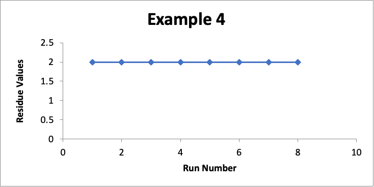
In this example with a limit of 10.0 mcg/swab, my residue values for that one location are essentially unchanged at 2.0 mcg/swab (realizing that in a real situation they may vary slightly, such as between 1.7 and 2.3). While I could do a process capability for such data, I will not because it involves only a small number of data values. It should be obvious that the Cpu using this data is >10.0). So in this case I am more than happy with the consistency of this cleaning process for Location XYZ.
In this example, the focus is on data for a different specific location (let’s call it “Location PQR”). In eight successive runs, my residue values are as shown in the line graph for Example #5 below.
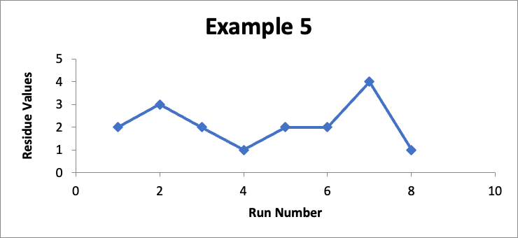
Do I like this? Well, I would prefer the Example #4 data, But with a limit of 10 mcg/swab, and with no consistent trend, I perhaps could live with it (and even more so if this involved a manual cleaning process). This would be a case where, although I would really want to have more data points, I might still do a Cpu calculation to establish that the Cpu index is only 2.6, which points to a not unreasonable level of control.
In this example, the focus is on data for still another different specific location (let’s call it “Location FGH”). In eight successive runs, my residue values are as shown in the line graph for Example 6 below.
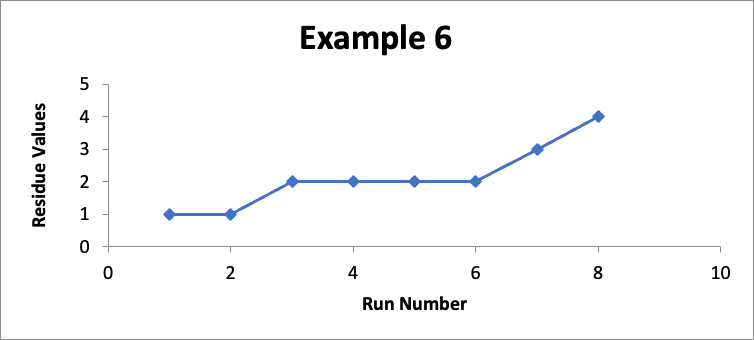
Do I like this? No; I should definitely be concerned! The values in Example 6 are exactly the same as the values in Example #5 (albeit the correspondence to the “Run Number” is different). So in Example #6 the Cpu is exactly the same at an index of 2.6. Regardless of that Cpu value, something is happening in my cleaning process (which could be in the cleaning procedure, the sampling procedure, or the analytical procedure, as well as other possibilities such as changes in the equipment or in the product manufacturing process). While I am still below my limit of 10 mcg/swab, it should be obvious if this trend continues I will soon exceed that limit. So I should definitely do an investigation and take corrective and/or preventive actions.
As illustrated in these examples, the evaluation of data over time should be part of what I consider in the assessment of my cleaning validation program. The emphasis in this series of three Cleaning Memos is looking beyond just a Cpu index to determine the health of my program. Next month will be one additional related subject, which will be the establishment of alert and action levels for data values as part of my routine monitoring.
Copyright © 2022 by Cleaning Validation Technologies